Reliability diagram
Reliability Diagram is a tool to visualize the calibration of a model given a set of data. It groups the data into bins and plots the accuracy of each bin against the average predicted value for that bin. The reliability diagram can be plotted for top-class prediction only or for a given class. The calzone package provides a function to calculate and plot the reliability diagram.
[1]:
### Import the necessary libraries and load the data
import numpy as np
from calzone.utils import reliability_diagram,data_loader
from calzone.vis import plot_reliability_diagram
### loading the data
wellcal_dataloader = data_loader(data_path="../../../example_data/simulated_welldata.csv")
[13]:
### Create and plot the top-class well calibrated data
reliability,confindence,bin_edges,bin_counts = reliability_diagram(wellcal_dataloader.labels, wellcal_dataloader.probs, num_bins=15,class_to_plot=None) #clasto plot is None mean calcuate for top-class
# Plot the reliability diagram
plot_reliability_diagram(reliability,confindence,bin_counts,error_bar=True,title='Top class reliability diagram for well calibrated data')

The error bar in the reliability diagram is the 95% confidence interval calculated using the Wilson score interval, which assumes that samples in a bin are a series of Bernoulli trials with the success probability equal to the mean predicted probability. The confidence interval is only for reference and might not be exact.
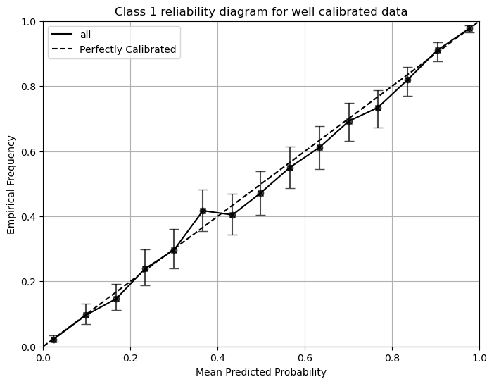
Since we have a binary classification problem, the mean predicted probability will not go below 0.5 for the top-class reliability diagram. We will proceed to plot the class 1 reliability diagram.
[14]:
### Create and plot the class 1 well calibrated data
reliability,confindence,bin_edges,bin_counts = reliability_diagram(wellcal_dataloader.labels, wellcal_dataloader.probs, num_bins=15,class_to_plot=1)
# Plot the reliability diagram
plot_reliability_diagram(reliability,confindence,bin_counts,error_bar=True,title='Class 1 reliability diagram for well calibrated data')
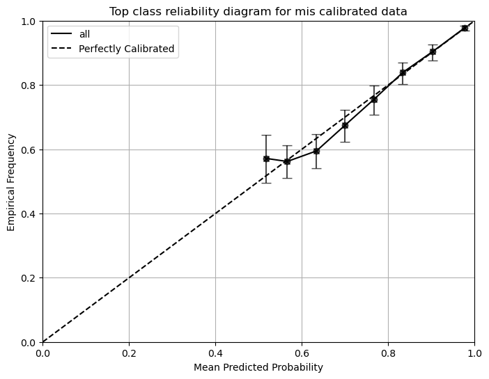
Class-by-class reliability diagrams reveal more information about the model’s calibration. The top-class reliability diagram could be misleading, as it might show reasonable calibration for the top class, while the model could be overconfident for the other classes. We demonstrate this in the following example.
[40]:
### We will artificially drop the prevalence of class 1
# The top-class reliability diagram will still look good
# But the class-1 reliability diagram will be very bad
from calzone.utils import softmax_to_logits
from scipy.special import softmax
import numpy as np

test_dataloader = data_loader(data_path="../../../example_data/simulated_welldata.csv")
class_1_index = (test_dataloader.labels==1)

# We will drop 50% of class 1 samples
class_1_samples = np.where(class_1_index)[0]
drop_indices = np.random.choice(class_1_samples, size=int(len(class_1_samples)/2), replace=False)

mask = np.ones(len(test_dataloader.labels), dtype=bool)
mask[drop_indices] = False

test_dataloader.labels = test_dataloader.labels[mask]
test_dataloader.probs = test_dataloader.probs[mask]
test_dataloader.data = test_dataloader.data[mask]
[ ]:
### Create and plot the top-class reliability diagram
# The reliability diagram still closely resembles the well-calibrated one
reliability,confindence,bin_edges,bin_counts = reliability_diagram(test_dataloader.labels, test_dataloader.probs, num_bins=15,class_to_plot=None)
plot_reliability_diagram(reliability,confindence,bin_counts,error_bar=True,title='Top class reliability diagram for mis calibrated data')
[ ]:
### Create and plot the class-by-class reliability diagram
# The reliability diagrams for class 1 and class 0 are very bad
reliability_0,confindence_0,bin_edges,bin_counts_0 = reliability_diagram(test_dataloader.labels, test_dataloader.probs, num_bins=15,class_to_plot=0)
reliability_1,confindence_1,bin_edges,bin_counts_1 = reliability_diagram(test_dataloader.labels, test_dataloader.probs, num_bins=15,class_to_plot=1)
reliability = np.vstack((reliability_0,reliability_1))
confindence = np.vstack((confindence_0,confindence_1))
bin_counts = np.vstack((bin_counts_0,bin_counts_1))
plot_reliability_diagram(reliability,confindence,bin_counts,error_bar=True,title='class-by-class reliability diagram for mis calibrated data',custom_colors=['blue','red'])
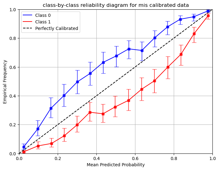
The example shows that prevalence shift in the testing data can lead to miscalibration in a posterior sense. Calzone provides a method to adjust for this. Prevalence is independent of the model itself, and the model may still produce correct likelihood ratios. See the prevalence adjustment section for more discussion.
References
Bröcker, J., & Smith, L. A. (2007). Increasing the Reliability of Reliability Diagrams. Weather and Forecasting, 22(3), 651–661. https://doi.org/10.1175/WAF993.1